

Across digital finance, friction is the silent killer of growth. It shows up when users abandon onboarding halfway through, when a 3D Secure prompt interrupts checkout, or when “security” feels more like suspicion than protection.
The irony is that most of these frictions were designed to create trust (by verifying, protecting, and securing). Yet, when poorly executed, they do the opposite. This is the paradox at the heart of fintech UX: the very systems built to inspire confidence often end up eroding it.
In this article, we break down how trust is lost and rebuilt across three moments that define every fintech experience: onboarding, authentication, and everyday security.
Friction kills trust before it’s earned
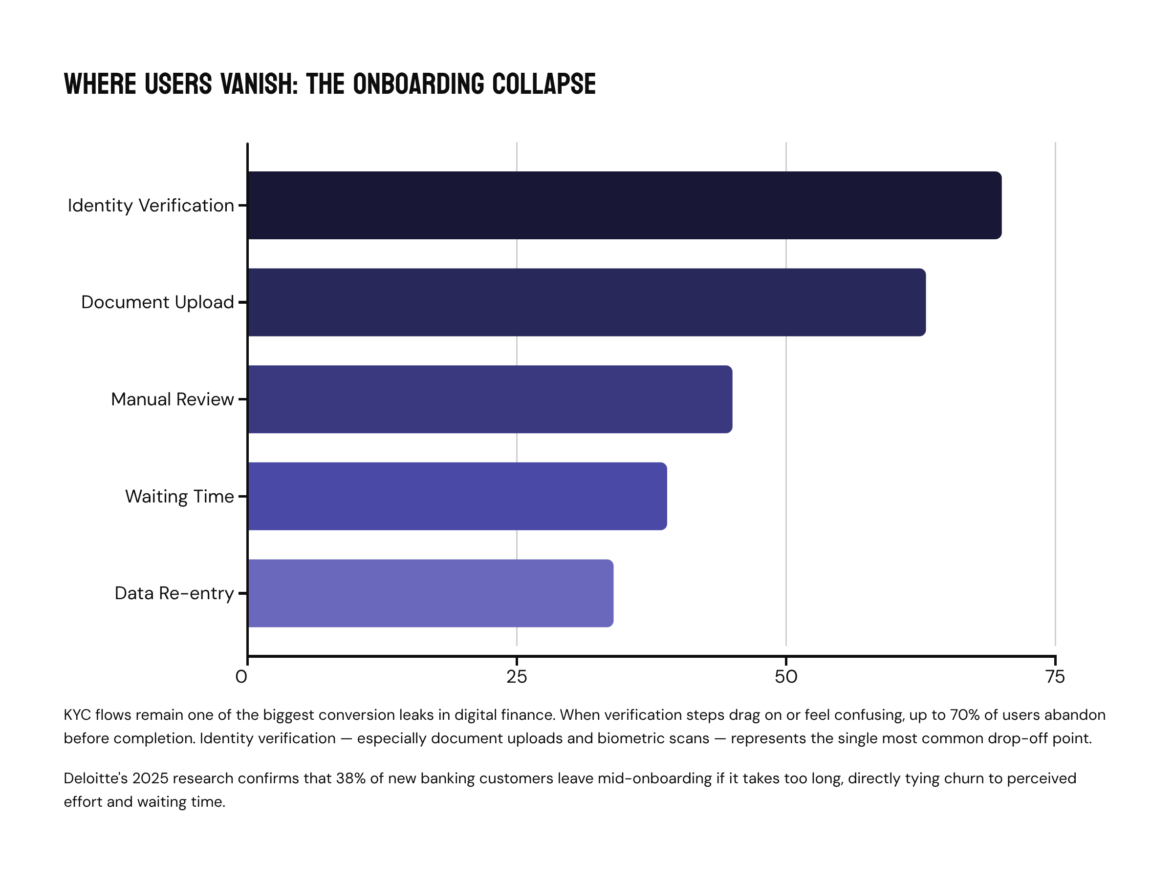
Every fintech product team knows the pain of watching users vanish midway through onboarding. You can see it right there in the analytics: a promising sign-up curve that collapses the moment KYC begins. Lengthy and complex “Know Your Customer” flows remain one of the biggest conversion leaks in digital finance.
Recent studies back up what founders and product leads already feel instinctively. When verification steps drag on or feel confusing, up to 70% of users can abandon the process before it’s complete. Identity verification, especially document uploads or biometric scans, is the single most common drop-off point. Deloitte’s 2025 research into retail banking echoes this pattern: 38% of new customers leave mid-onboarding if it takes too long, directly tying churn to perceived effort and waiting time.
Across fintech, the data paints a consistent picture. Drop rates hover above one-third for identity steps, with global averages hitting 63% abandonment when onboarding feels slow or stressful. Even worse, processes that rely on manual document review, repetitive data entry, or back-office bottlenecks can push churn from 26% to 45% in a single year — a direct cost to growth, trust, and lifetime value.
Why Users Drop
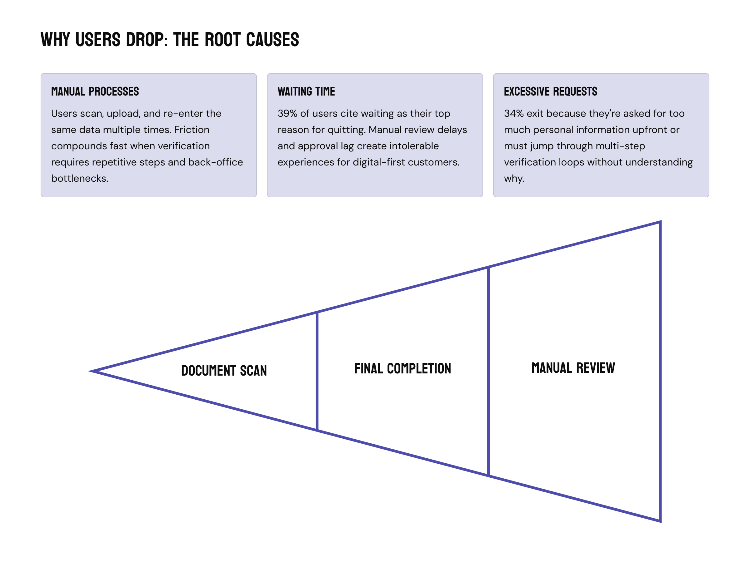
Manual processes are still at the root of the problem. When users are asked to scan, upload, and re-enter the same data multiple times, friction compounds fast. Add waiting time (which 39% of users cite as their top reason for quitting), and the experience becomes intolerable. Another 34% exit because they’re asked for too much personal information or must jump through multi-step verification loops. Digital-first users have made their preferences clear. Over half say they’d finish onboarding (and even add more services) if verification were fully automated and digital, without offline steps or manual review delays.
The Path Forward: How to make onboarding work
Industry analysts call these “leaky funnels” for a reason — they bleed potential revenue before it ever reaches activation. The real improvement lies in rethinking onboarding for automation and simplicity. Fintechs that show value fast, skip redundant docs, and remove verification ping-pong see abandonment rates fall sharply. So, the playbook goes like this:
Automate What Slows You Down
AI-assisted verification has made this balance between safety and simplicity possible. Compared to legacy manual checks, automated KYC and identity validation can reduce onboarding time by 30–50%, according to multiple reviews and case studies. Add automated workflows that approve low-risk users right away and send only tricky cases for manual review, and the whole process gets simplified.
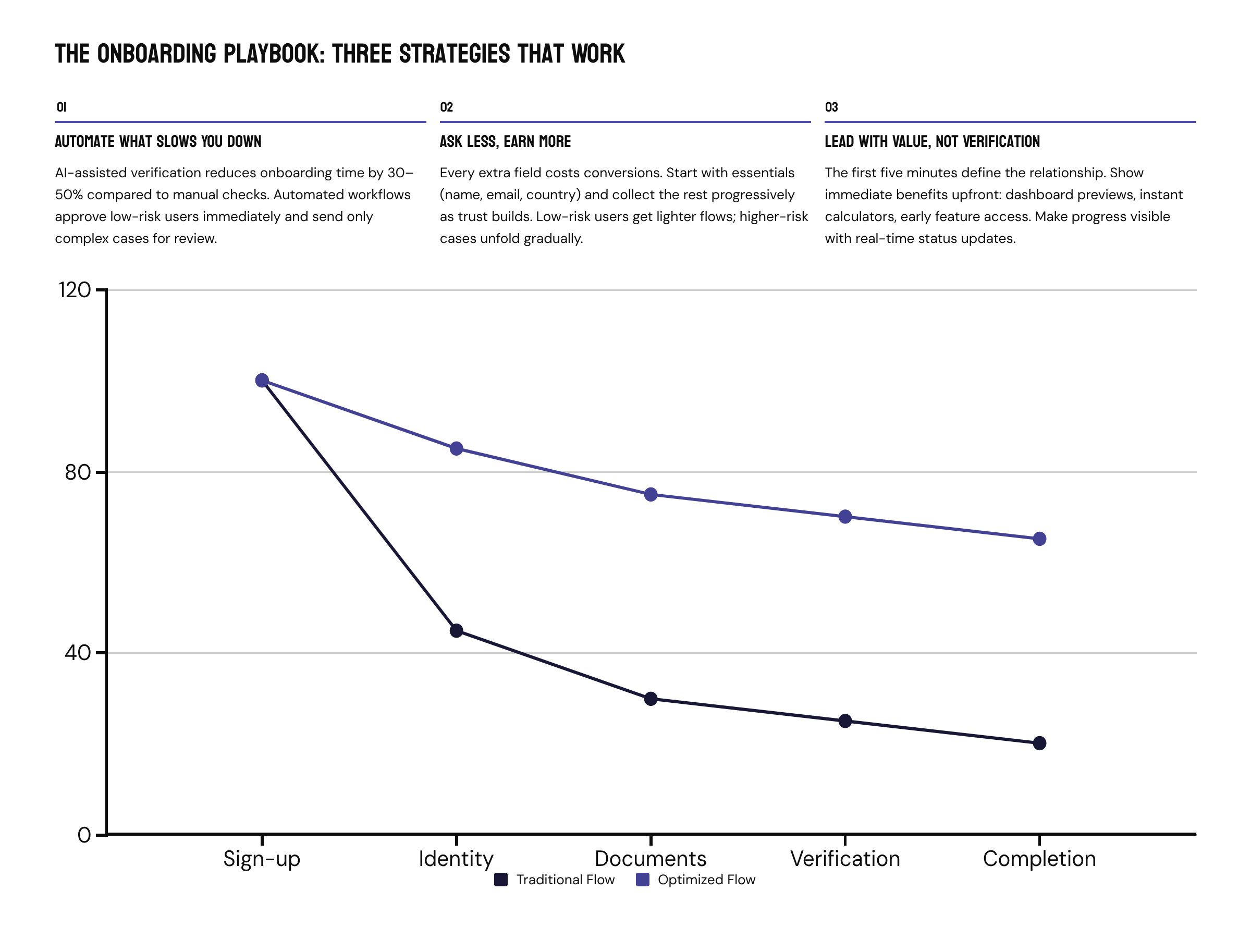
Ask Less, Earn More
Every extra field costs you conversions. Instead of front-loading data requests, start with the essentials (name, email, country), and collect the rest as trust builds. Low-risk users get a lighter flow; higher-risk cases can unfold progressively. Combine that with progressive disclosure (one task per screen, not ten) and a personalized path for each segment, and you get rid of what used to feel like bureaucracy.
Lead With Value, Not Verification
The first five minutes define the relationship. If users don’t see value fast, they drop. Try showing immediate product benefits upfront: a dashboard preview, an instant calculator, even early access to limited features.
Transparency also matters. Tell users why you need each document and how their data stays protected. The more transparently a platform communicates progress (“your ID is being verified,” “you’re 80% done,” “next step: link your account”), the more confident users feel. In fact, UX patterns that make progress felt rather than merely promised are proven to lower drop-offs and boost activation rates. Real-time feedback, clear status updates, and human tone in error messages make compliance feel less like red tape and more like trust-building.
When Security Backfires: The UX Cost of Strong Customer Authentication
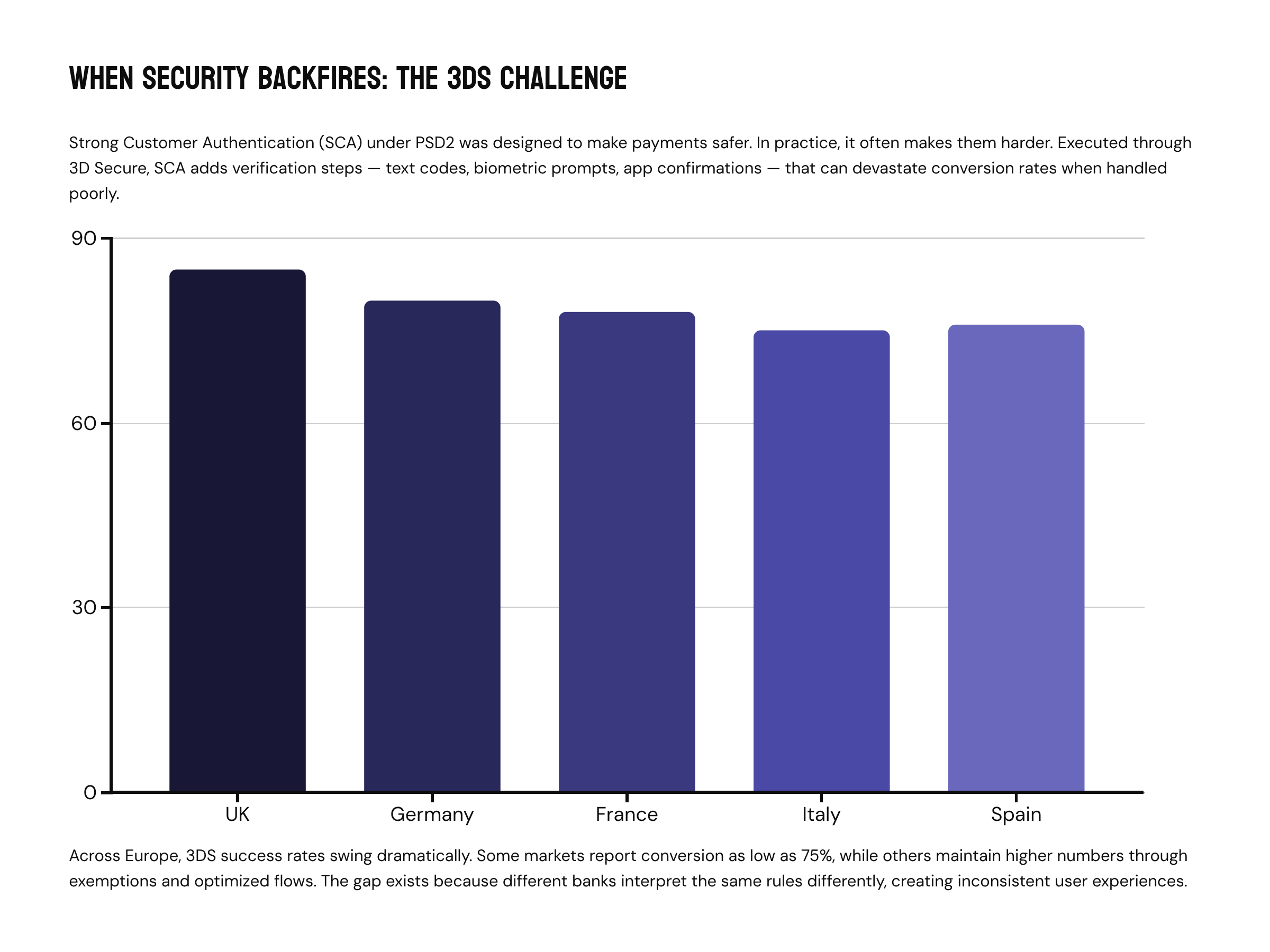
Let’s talk about the Strong Customer Authentication (SCA) under PSD2 that was designed to make payments safer. In practice, it often makes it harder. Executed through 3D Secure (3DS), SCA adds extra steps to verify a user’s identity — a text code, a biometric prompt, or an app confirmation. It’s effective for fraud prevention but, when handled poorly, can devastate conversion rates.
Across Europe, 3DS success rates can swing dramatically. Some markets report conversion as low as 75%, while others maintain far higher numbers by using exemptions and optimized authentication flows. Why the gap? Because different banks interpret the same rules differently.
Some view a 3DS trigger as a red flag, penalizing transactions that require extra authentication. Others reward 3DS-protected payments, treating them as more trustworthy. That’s where inconsistent user experience comes from, so the same customer might breeze through one checkout and abandon the next.
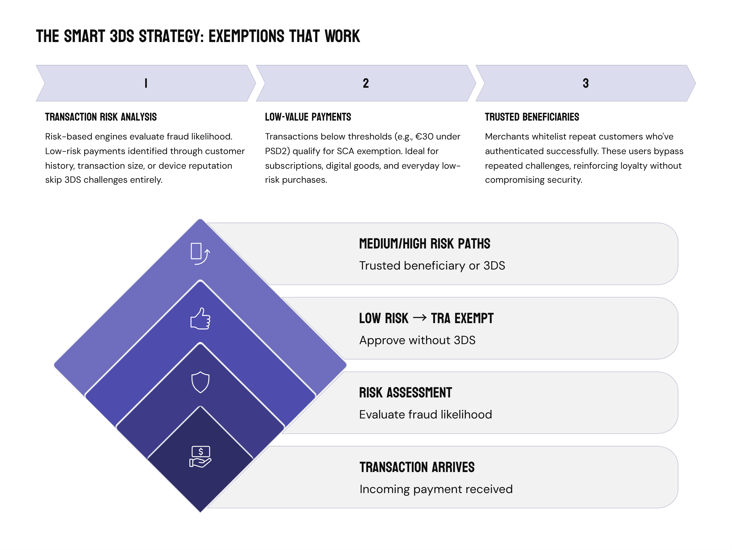
As a founder, you can look into a 3DS strategy: tailor authentication based on transaction risk and context. Low-risk payments should pass through frictionless flows or use available exemptions. This can include:
- Transaction Risk Analysis (TRA)
TRA uses a risk-based engine to evaluate each transaction’s likelihood of fraud. Low-risk payments (identified through customer history, transaction size, or device reputation) can skip the 3DS challenge entirely. - Low-Value Payments
Transactions below a threshold (e.g., €30 under PSD2) qualify for SCA exemption. For micro-payments, this keeps the user journey instant — ideal for subscriptions, digital goods, and everyday low-risk purchases. - Trusted Beneficiaries
Merchants can whitelist trusted payees who’ve already authenticated successfully. These repeat customers bypass repeated challenges, reinforcing loyalty and convenience without compromising security. Used together, these exemptions form a toolkit for balancing protection and performance, letting legitimate payments flow while catching the risky ones.
It’s also a good idea to stay in sync with issuers and payment service providers (PSPs). Regularly review how they interpret and apply SCA rules so your payment flow minimizes unnecessary challenges while staying compliant.
The Psychology of Security: When Safety Starts to Hurt
Users don’t hate security. They hate friction disguised as security. They’ll gladly accept smart convenience: remembered identity, faster sign-ins, one-tap confirmations. In their minds, that is security. It feels competent, stable, and designed with care. But layer on too many checkpoints (multiple OTPs, repeated logins, redundant data entry), and the story flips, eroding trust and driving abandonment.
Risk and user experience don’t have to sit on opposite sides of the table. When risk actually appears, security should adapt, not overreact. Here’s how the security-UX matrix can help you achieve this in practice.
The security-UX matrix
Every digital product lives somewhere on the spectrum between safety and satisfaction. Imagine four quadrants:
- Low UX / Low Fraud: Hyper-secure but painful — users drop before they transact.
- High UX / Low Fraud: The sweet spot. Seamless flow, adaptive protection, and satisfied users.
- Low UX / High Fraud: The danger zone. Poor interfaces and weak defense.
- High UX / High Fraud: Feels smooth but leaves the door wide open.
The Security–UX Matrix is one of those tools that helps you see your product the way users and fraudsters both do. Plot where your product sits today: how much friction users feel vs. how much risk you’re actually stopping. If you’re heavy on checks but light on conversions, you may find yourself overprotecting. If everything feels smooth but fraud is creeping up, you’re most likely under-securing.
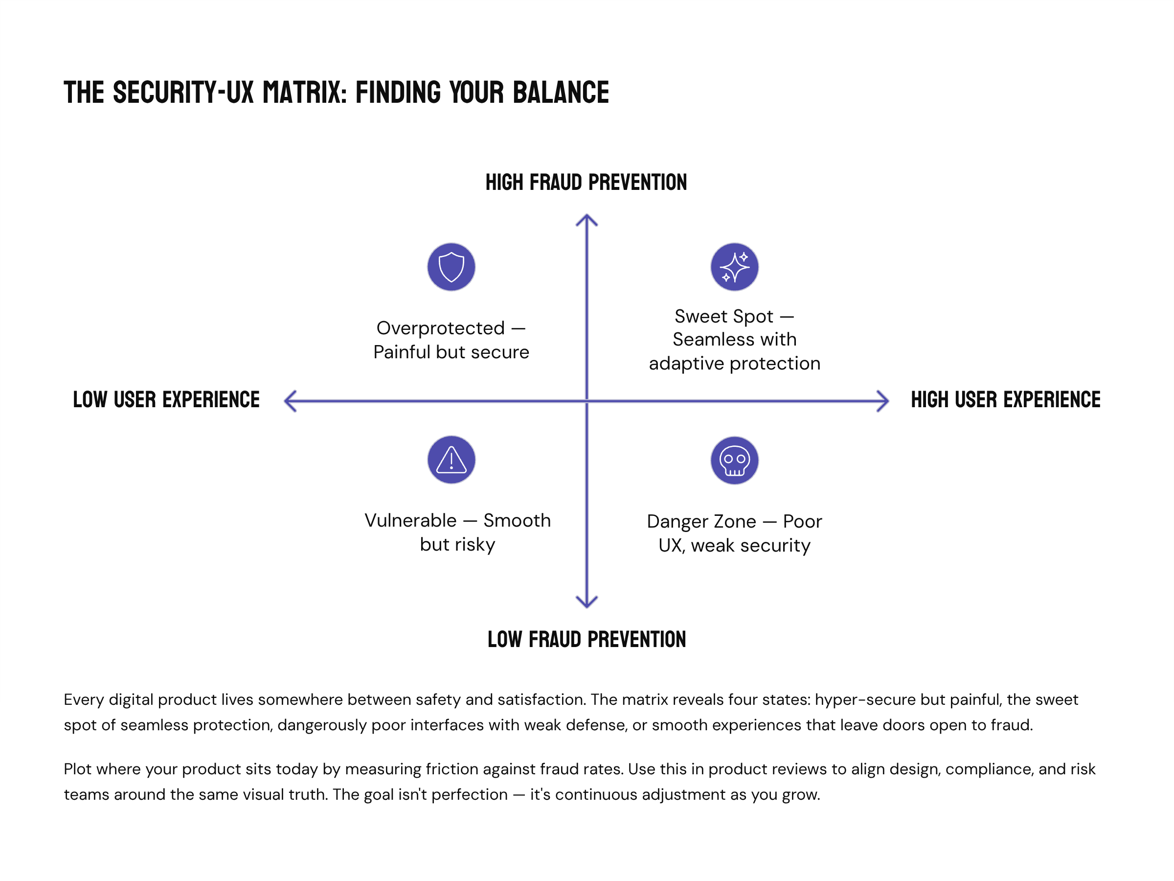
The goal is to find balance and keep adjusting as you grow. Use the matrix in product reviews to align design, compliance, and risk teams around the same visual truth. Let it guide when to automate, when to add friction, and when to get out of the user’s way. Over time, you’ll start seeing it less as a security diagram and more as a growth map, one that keeps trust measurable and UX intentional.
Wrapping Up
Every verification, every confirmation screen, every moment of waiting tells users something about your product. Fintech founders who master that balance between felt safety and frictionless flow convert trust into a growth engine.
If your onboarding feels heavier than it should, or your 3DS drop-offs are creeping higher than you’d like, it’s probably time for a closer look.
We’ll help you find the breakpoints before your users do. Request an audit — we’ll analyze your KYC and authentication flows, flag friction hotspots, and model the conversion impact of automation and smarter security logic.


![[SIGNALS] Banner & visuals for the Interview_ Giorgio Natili (1)](https://insart.com/wp-content/uploads/2026/05/signals-banner-visuals-for-the-interview_-giorgio-natili-1-300x169.jpg "The Best Scaling Decision You'll Make Has Nothing to Do With Infrastructure: Conversation with Giorgio Natili")


 Save Your SaaS Startup")

")


