 Save Your SaaS Startup")
 Save Your SaaS Startup")

Introduction: The High Stakes of Fintech Design
Fintech startups move fast to get their product to market – but moving fast without a design system can create hidden costs. Design bottlenecks, fragmented UIs, and redundant work aren’t just minor workflow issues – they become business growth blockers . In a domain where trust and clarity are paramount, inconsistent or clunky user interfaces can undermine user confidence and slow down development of new features.
Studies show that investing in a design system yields significant returns: on average, businesses see a 135% ROI from design systems within 5 years. For fintech companies racing to scale across web and mobile platforms, the returns can be even higher when a design system is implemented correctly. Why? Because a well-built design system establishes a shared language between design and engineering, boosts product velocity, and guarantees a consistent, high-quality user experience – whether you’re shipping one feature or ten at once . In fact, common benefits include up to 50% faster design-to-development handoffs , designers completing tasks 34% faster with a system , and significantly reduced development times. Ultimately, a design system isn’t a luxury for big companies only – it can be a startup’s secret weapon to save time, cut costs, and build user trust from the ground up.
This case study follows the journey of a fictional fintech SaaS startup, “FinFuture,” as its founders and product leaders discover the importance of a design system. We’ll dive into FinFuture’s early struggles with inconsistent UI and slow development, analyze the problems caused by not having a design system, and see how implementing one turned things around. Along the way, we’ll explore how to actually build a design system (design tokens, documentation, and all), review popular frameworks (Ant Design, Material-UI, Shadcn/UI) in a fintech context, and highlight how firms like INSART help companies adapt design systems for their needs. We’ll also look at the business impact through key metrics: time saved, faster release cycles, reduced bugs, improved team morale, and better UX for users.
Let’s start with FinFuture’s story – a cautionary tale of a fast-moving startup that hit a UI wall, and how they climbed over it with a design system.

The Startup Without a Design System: A Narrative
Meet FinFuture, a SaaS platform for personal finance management that started with two developers and a dream. In the beginning, FinFuture’s founders were laser-focused on building a Minimum Viable Product that could attract early users and investors. Speed was the name of the game. The small team quickly pushed out features: budgeting tools, investment tracking, payment reminders – all coded rapidly to meet customer demand. The approach was “just make it work,” and for a while, it did. They cobbled together UI components from multiple sources – a bit of open-source here, a CSS framework there – whatever got the job done fastest. There was no time (they thought) to worry about a formal design system or extensive style guide.
As FinFuture’s user base grew and new developers and a UX designer joined the team, the cracks in this move-fast approach began to show. The UX designer, Priya, noticed something worrying during a product demo: every part of the app looked and behaved a little differently. The dashboard had one style of buttons and charts, the budgeting module (built later by a different developer) used another style entirely, and the mobile app felt like a distant cousin of the web app. One investor testing the app remarked, “It’s functional, but parts of it feel like different products.” That was a red flag. FinFuture’s leadership realized they had a consistency problem that could erode user trust – after all, if the interface feels patchwork, would users trust it to manage their money?
Internally, the team felt the pain too. New developers found it slow to onboard because there was no single source of truth for how UI elements should look or be coded. Each engineer had to dig through past code or ask around to understand which button style to use or how form validation messages should appear. This onboarding drag is common – without a design system, new team members spend extra time piecing together a product’s design language. At fast-growing startups, “if everything is documented and easy to find, new hires can hit the ground running on the first day” – but FinFuture’s documentation was nonexistent.
By the time FinFuture had a dozen employees, releasing new features became painfully slow. Paradoxically, it wasn’t the backend or the core functionality causing delays – it was the UI. Every feature seemed to require reinventing some UI component or cleaning up inconsistent layouts from previous rushed releases. A simple update like adding a “Withdraw Funds” action took far longer than expected because the web team’s button looked different from the mobile team’s button (one was green and one was gray, confusing users as to whether the action was available) . The lack of a unified design was creating a maze of rework. As one developer lamented, “I spend more time fiddling with CSS to match what another developer did than actually building new features.” FinFuture had hit a wall: their product was evolving, but the UI was a Wild West, and it was slowing everything down.
Design Gone Wild: Problems Caused by No Design System
What exactly was happening inside FinFuture when it lacked a design system? Let’s break down the specific issues that emerged:
Duplicate & Inconsistent Components: In the absence of a shared component library, designers and developers at FinFuture unknowingly created slightly different versions of the same UI elements over and over. The app ended up with multiple styles of alerts, modals, and input forms. For example, there were over a dozen different button styles in use – some with rounded corners, some square, various shades of blue and green, and inconsistent hover effects. This meant a huge waste of effort: team members were solving the same design problems repeatedly, instead of reusing existing solutions. FinFuture’s case is not unique – without a central repository of components, “designers and developers must solve the same problems repeatedly and re-create solutions that already exist” . This redundancy isn’t just inefficient; it introduces opportunities for errors. Indeed, FinFuture’s QA team often found UI bugs where one variant of a component didn’t get updated or tested like the others.
Fragmented Brand & User Experience: Over time, FinFuture’s brand identity became muddled. The marketing site and the app used different color palettes; even within the app, key user flows felt disjointed. Users would navigate from one feature to another and have to relearn the interface quirks each time. For instance, the process to filter transactions looked completely different on the “Spending Analytics” page versus the “Budget Overview” page, even though both were essentially lists of transactions. This kind of inconsistency creates a cognitive burden on users, who may get confused or frustrated by the unpredictable UI. In FinFuture’s early product, a “Withdraw” button was green on one screen but gray (disabled-looking) on another, leading some users to falsely assume they couldn’t withdraw funds in certain contexts . Consistency isn’t just an aesthetic concern – it directly impacts usability and trust. In fintech especially, trust is earned through clarity and reliability; users expect the same logic and look across platforms so they aren’t surprised at critical moments . FinFuture’s inconsistent UX was risking that trust.
High Design & Tech Debt (and Onboarding Costs): Every sprint that went by without a unified design approach added to FinFuture’s design debt. Minor inconsistencies and quick-fixes accumulated with each feature release, “eventually turn[ing] into an inconsistent, disjointed UI that delivers a disappointing experience” . This design debt had tangible costs. New designers joining the team struggled to know which of the many style variations to follow – should they copy the style from Feature A or Feature B? With no single source of truth, the answer was often “it depends,” or worse, “just make yet another variant.” On the engineering side, onboarding a new front-end developer meant exposing them to a tangled codebase of duplicate styles and ad-hoc component implementations. The new hires often spent weeks refactoring UI code or hunting down the right hex color or widget code to reuse. In contrast, companies with a strong design system report that newcomers can start contributing much faster, since everything is clearly documented and standardized . FinFuture was incurring extra training time for each hire – time that a lean startup can scarcely afford.
Slower Development and Release Cycles: Perhaps the most painful business impact of all the above issues was speed – or lack thereof. As FinFuture expanded, their release cycle slowed down dramatically. What used to be weekly updates turned into monthly ones. The culprit was the front-end polish stage: integrating new features into the mishmash UI took extra cycles of design review and rework. Without a shared design language, every feature felt like a custom project. Developers frequently had to call design review meetings to decide basic things (e.g. “Should this new settings page use the style from the dashboard or the style from the analytics section?”), and designers had to comp screens from scratch because existing patterns weren’t trustable. This kind of misalignment is exactly what happens when “no shared source of truth means everyone builds from a different playbook, resulting in rework, delays, and frustration” . FinFuture’s CTO noticed that in the last quarter, at least 30% of development time was spent on re-doing or tweaking UI elements that should have been trivial – an alarming drag on velocity. And in a startup environment, delayed releases can mean missed market opportunities.
User Trust and Conversion Issues: Finally, although FinFuture’s core functionality was strong, the inconsistent UX was starting to affect user perception. Beta users gave feedback that the app felt “confusing” in places, and customer support calls were coming in about things like “How do I do X? I saw it in one place, but not sure if it’s available elsewhere.” A seamless and familiar UI is crucial in fintech – users need to feel secure and confident as they manage sensitive financial data. Inconsistent design eroded that confidence. Research shows that a familiar, intuitive UI improves user satisfaction and retention, whereas forcing users to relearn patterns increases drop-off in critical flows . FinFuture’s leadership realized that if they didn’t address the UX consistency, they might start losing users to more polished competitors.
In short, FinFuture’s lack of a design system led to chaos – duplicated effort, a fragmented product, slow development, and a shaky user experience. The chaos was palpable not just to the team, but visually in the product itself.
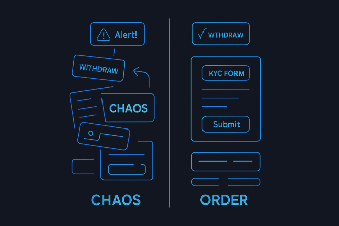
Chaos vs. order: On the left, FinFuture’s UI components before the design system – a haphazard pile of different buttons, alerts, and forms (“CHAOS”) that resulted from each team working in isolation. On the right, a glimpse of the unified design system to come – one coherent set of components (“ORDER”) including consistent Withdraw buttons and KYC forms. A design system turns UI chaos into an orderly toolkit that everyone can rely on.
Something had to change. FinFuture’s founders decided it was time to hit pause on the feature frenzy and address the design problem at its root. It was time to implement a design system.
Turning Point: Embracing a Design System
The wake-up call for FinFuture came during a particularly messy release. The team had spent two weeks building a new “Investment Planner” module, only to realize during final QA that it looked nothing like the rest of the app. In a tense meeting, the product lead asked, “How did this happen? Didn’t we have design specs?” The truth was the designer had provided a spec, but in the absence of a common design language, the developers interpreted it in various ways. Everyone did their best, yet the end result felt off-brand. It was a classic case of misaligned understanding due to no shared design system.
At this point, FinFuture’s CEO and CTO agreed to invest time in creating a formal design system. They had heard from other startups (and industry articles) that a design system could accelerate development and vastly improve consistency. In fact, a 2019 experiment by Figma found that designers working with a design system completed tasks 34% faster than those without one. Also, companies surveyed by Forrester reported major efficiency and UX gains from design systems, which is why 65% of companies were already using one by 2020 . FinFuture didn’t want to fall behind.
However, they knew they needed help – building a design system from scratch can be daunting, especially when the team is new to it. This is where outside expertise can accelerate the process. FinFuture engaged a UX consulting partner, an agency experienced in fintech product design (similar to how INSART or ProCreator work with fintech startups). These experts had seen the same story at many startups: “Design and UI challenges slowing down growth? The solution is a design system approach.” At ProCreator, for example, they emphasize solving fintech UI challenges “through a fintech design system approach” – exactly what FinFuture needed.
Together, FinFuture’s team and the consultants set out on a mission: to turn their patchwork of UI elements into a cohesive, scalable design system. They gave the initiative a name – “FinFuture Design System 1.0” – to signal its importance, and treated it like building a key product feature. Founders allocated dedicated time and even postponed a couple of feature launches, recognizing that this short-term slowdown would pay off in long-term speed.
Implementing the Design System: From Chaos to Clarity
Building a design system can feel like repairing an airplane while it’s flying – you have to improve the design and codebase while the product is still evolving. FinFuture tackled it methodically, in a series of phases. Here’s how they implemented their design system, step by step:
1. UI Audit and Inventory of Components
FinFuture’s design lead, Priya, began by cataloguing every UI component and style in the product. This was a detective job: combing through the app’s screens and code to find all the variations of buttons, form fields, modals, menus, icons, etc. The findings were both enlightening and sobering. They discovered, for instance, over 80 unique buttons and 100+ color codes used across the app! (Not far-fetched – another fintech company, KredX, found 77 unique colors and 343 color declarations in their products before adopting a design system .) Seeing all the duplicates laid out made it clear how much inefficiency had crept in.
Priya created a visual interface inventory board that showed these inconsistencies side by side – multiple styles for the same function. This kind of inventory is a critical first step; as one design system expert notes, it highlights all the inconsistent design solutions that need standardizing . At this stage, the team didn’t judge which version was “best” – they simply recorded everything. Developers were shocked to see, for example, how many slightly different table views they had coded for displaying transactions. The motto here was, “You can’t fix what you haven’t found.”
By the end of the audit, FinFuture had a master list of components and a clear picture of the chaos that needed organizing. This list would serve as the foundation for deciding which components to include in the new design system and which one of each type would become the standard.
2. Design Principles and Token Definition
Next, the team defined some design principles to guide their system. They agreed on values like Consistency, Clarity, Efficiency, and Accessibility. These principles would help in making decisions when trade-offs arose (for example, if a trendy new UI style was inconsistent with existing patterns, consistency would win out unless there was a strong reason to diverge).
Concurrently, FinFuture introduced the concept of design tokens – the basic style values that would drive the entire system’s look and feel. Design tokens are named, reusable variables for fundamentals like colors, spacing, typography, and more . The idea is to define these once and use them everywhere, so a change to a token propagates consistently. FinFuture’s UI audit had shown they were using a wild rainbow of colors and dozens of font sizes. Now it was time to standardize.
They distilled the color palette down to a core set of brand colors and neutrals. For example, they kept FinFuture’s signature blue (refined to meet contrast accessibility standards) and a secondary teal for accents, and defined a range of grays for backgrounds and text. All other oddball hex codes were slated for removal. This mirrors what KredX did – reducing 77 colors to a cohesive palette of just greys, teals, and blues – and what a design system expert described: going from hundreds of unique colors to a structured palette with primaries, secondaries, and proper tonal ranges . The payoff of this exercise? Clarity and performance. As seen in another case, eliminating hundreds of unnecessary style variations (like extra colors) can even speed up your app – one product’s checkout page load time improved from ~5 seconds to 2.8 seconds after they standardized and reduced their color palette, because the browser had fewer styles to load and fewer chances for bugs . FinFuture hoped for similar improvements.
They also set tokens for spacing (e.g. a scale of 4px, 8px, 16px, 24px for small to large gaps), font sizes (perhaps a base size of 16px, with defined steps for H1, H2, etc.), and other properties like border radius (maybe a single standard radius for all rounded corners). Even common shadows and opacity levels were given token values. By defining these design tokens from day one, FinFuture ensured that updating any aspect of style in the future would be simplified – you tweak the token in one place, and it updates across all components .
To illustrate, here’s a simplified example of design tokens in a JavaScript/JSON format that FinFuture might have used:
// design-tokens.js
export const tokens = {
  colors: {
    primary: "#3479F6",      // FinFuture Blue
    primaryHover: "#2A62C9",
    secondary: "#30BDA8",    // Teal accent
    secondaryHover: "#24a18f",
    neutral0: "#FFFFFF",     // white background
    neutral100: "#000000",   // black text
    neutral90: "#1A1A1A",    // near-black for text
    neutral10: "#F5F5F5",    // light gray background
    // ...other color tokens like success, warning, error colors
  },
  typography: {
    fontFamilyBase: "'Inter', sans-serif",
    fontSizeBase: "16px",
    fontSizeLg: "20px",
    fontSizeSm: "14px",
    headingFont: "'Inter', sans-serif",  // using same for simplicity
  },
  spacing: {
    xs: "4px",
    sm: "8px",
    md: "16px",
    lg: "24px"
  },
  radii: {
    card: "8px",      // standard border-radius for cards and containers
    button: "4px",    // standard radius for buttons
    circle: "50%",    // for circular elements like avatars
  }
  // ...other tokens for z-index, shadows, etc.
};
These tokens were then used by designers in Figma and by developers in code. For example, a developer building a primary button would reference tokens.colors.primary for the background color, tokens.spacing.sm for padding, tokens.radii.button for the border radius, etc., instead of hardcoding values. Here’s what a simple React button component might look like using such tokens:
import { tokens } from './design-tokens';

function PrimaryButton({ label, onClick }) {
  return (
    <button onClick={onClick} style={{
      backgroundColor: tokens.colors.primary,
      color: "#fff",
      padding: `${tokens.spacing.sm} ${tokens.spacing.md}`,
      border: "none",
      borderRadius: tokens.radii.button,
      fontFamily: tokens.typography.fontFamilyBase,
      fontSize: tokens.typography.fontSizeBase,
      cursor: "pointer"
    }}>
      {label}
    </button>
  );
}
The above code is simplified, but it illustrates the point: by using a centralized set of design tokens, FinFuture’s developers ensure that every part of the product is speaking the same design language. If tomorrow the brand team decides to change the primary color or update the base font, it’s a one-time change in the token definitions and the whole app updates, with no tedious hunt-and-replace needed.
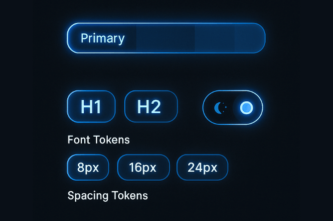
Design tokens in action – a concept diagram showing standardized style elements. Color tokens (like a “Primary” color swatch) define the core palette; typography tokens set consistent font styles for headings (H1, H2, etc.); and spacing tokens (8px, 16px, 24px) enforce a uniform spacing scale. In FinFuture’s design system, tokens became the single source of truth for all these basic decisions, making it easy to maintain a coherent visual language across the app.
3. Reusable Components Library (Figma and Code)
With the basic style foundation laid, FinFuture moved on to building the actual components of the design system. This phase was about turning the raw materials (tokens) into usable parts (buttons, inputs, cards, navbars, etc.).
On the design side, Priya and her team used Figma (a collaborative design tool) to create a Figma library of components. They followed the principles of Atomic Design – breaking down UI into Atoms, Molecules, Organisms, Templates, etc., which is a popular methodology for design systems . For example:
Atoms: the simplest building blocks – a text style, a color style, an icon, a basic button.
Molecules: combos of atoms – e.g. a form input with a label and icon, or a button with an icon.
Organisms: larger sections composed of molecules – e.g. a navigation bar with menus, or a transaction list composed of cards.
Templates/Pages: full page layouts using these organisms.
They first built out the Atoms: setting up Figma text styles for headings and body text using the chosen typography tokens, creating color style swatches linked to the token values, and drawing basic elements like a standard button shape, input field, etc. Each component in Figma was labeled clearly (no more “Rectangle 123” – now it was “Button/Primary” etc.) and documented with its various states (default, hover, active, disabled) . The design team ensured to include guidelines for responsive behavior (how does this component adapt on mobile vs desktop) and usage notes (e.g. “Use this component for primary actions; avoid using more than one primary button per screen” – the kind of rule that prevents misuse).
Meanwhile, on the development side, FinFuture’s engineers started building a matching component library in code. They decided to use modern front-end techniques to do this. For web, they used React with a tool like Storybook – an open-source tool for developing and showcasing UI components in isolation . The idea was to implement each component (button, input, modal, etc.) as a reusable React component that encapsulated the design specified in Figma. They aligned closely with the design team during this: as soon as a component was defined in Figma, a developer would pair with the designer to build it in code, ensuring pixel-perfect fidelity. This close designer-developer collaboration is critical: it ensures the design system isn’t just a Figma artifact but is truly implemented in the product’s codebase . In many failed attempts elsewhere, design systems “look good in Figma – but never reach production” ; FinFuture avoided that by involving developers from day one and integrating the system into their app’s code.
Each component in the code library was linked to the design tokens. For example, the React <Button> component didn’t have its own random styles; it pulled from the centralized token values (as illustrated in the code snippet above). They also used Storybook to document the code usage – Storybook displays each component with various props and states, acting as a “living style guide” for developers. FinFuture’s front-end lead required that any new UI element added to the product must first exist in the design system library (or be added to it if truly new). This governance ensured they didn’t slip back into old habits.
By the end of this phase, FinFuture had both a UI kit in Figma for designers and a component library in code for developers – all mirroring the same components. If a designer drags a “Success Alert” component onto a design, the developer can find <Alert type=”success”> in the code library to implement it, knowing it will match the design exactly. This shared library significantly streamlined the workflow. In fact, the whole design-to-development process became more like assembling a puzzle than inventing pieces from scratch. Designers could prototype screens in minutes by using pre-made components, and developers could build interfaces faster by composing those same ready-made parts. Multiply this efficiency across the team and “it translates into real value for the business” – features that used to take weeks could now be done in days, because much of the heavy lifting (the UI components and their behavior) was already solved.
4. Documentation and Guidelines
A design system isn’t just a collection of components; it’s also the rules and guidelines for how to use those components. FinFuture took documentation seriously. They created a dedicated space (a simple website or an internal wiki using tools like ZeroHeight or Notion) where all aspects of the design system were documented in plain language. This included:
Visual style guide: outlining the color palette, typography scale, spacing grid, icon library, with examples of how to apply them. For instance, guidelines on what each color is used for (e.g. primary blue for primary actions, green for success messages, etc.), and what not to do (e.g. “Don’t use red except for error states”).
Component usage guidelines: for every component in the library, there was a page detailing its purpose, all its states, and examples of usage. It answered questions like “When should I use this component? What variations are available? What are the edge cases? What should I avoid doing with it?” . For example, the documentation for a Modal component might note that it’s for short, focused tasks or alerts, should have a clear title and close button, etc.
Code snippets and integration tips: developers added notes on how to implement or override components if needed, any theming instructions, and how to contribute to the component library if a new pattern was needed.
Design tokens reference: a section listing all design tokens (colors, sizes, etc.) and their values, so anyone could quickly look up, say, the hex code for secondaryColor or the pixel value of spacing.md.
They kept the documentation lightweight but useful – the goal was not to write a 100-page tome that no one would read, but to provide “just enough guidance so that any designer, developer, or product manager can make informed decisions” . In essence, if a new team member had a question “How do I design feature X to fit our style?”, the answer should be findable in the design system docs.
Importantly, FinFuture also treated the documentation as a living resource. As the design system evolved, the docs were updated. They set up a regular review (maybe monthly) to catch any drift between the documented guidelines and actual practice. They also allowed team members to suggest improvements to the docs easily (through comments or an edit request flow), recognizing that a design system thrives only if teams know where to find things and how to use them . After all, “without proper documentation there is no design system, all you have is a toybox of building blocks with no way of knowing how to put them together” .
By now, FinFuture’s design system – let’s call it “FinUI” – was taking shape. It had the core components standardized and documented. The effect on the team was already noticeable: designers and developers were speaking the same language. They referred to components by agreed names (“Use the PrimaryButton from FinUI”, “Let’s put a Card organism on this page for the account summary”). This shared language eliminated a lot of ambiguity and back-and-forth that used to plague their process. It’s exactly what a good design system provides: “terms, phrases, and naming conventions that help cross-functional teams speak about the product and streamline design decisions” .
5. Adapting and Scaling Across Platforms
Fintech products like FinFuture often span multiple platforms (web, iOS, Android) and possibly white-labeled versions. FinFuture’s next step was to ensure their design system scaled across these contexts. They extended FinUI to cover responsive design (making sure components worked on small mobile screens as well as desktop) and platform-specific tweaks (perhaps using native mobile components styled to match, or ensuring their React Native components mirrored the web ones).
They also built in patterns for special fintech scenarios. For example, KYC (Know Your Customer) flow screens needed consistent treatment – they created reusable modules for document upload steps, identity verification prompts, etc., which followed regulatory guidelines. By standardizing these in the design system, they made sure compliance-related UIs were always implemented correctly and consistently. This has big benefits: consistent flows can speed up regulatory approvals and avoid compliance mistakes . FinFuture’s legal advisor was thrilled to see that things like disclaimer texts and verification steps were uniform everywhere, reducing the chance of a legal disclosure being accidentally omitted in some corner of the app.
They also incorporated accessibility from the get-go. FinUI components were all built to meet WCAG standards (e.g. sufficient color contrast, proper focus states, screen-reader friendly labels). Early on, they fixed their color contrast issues – remember that light teal that failed contrast tests? It was adjusted to a slightly darker teal that passed accessibility guidelines . By making accessibility “baked in” to every FinUI component, FinFuture ensured their product could be used by as many people as possible, including those with visual impairments. This is a smart move not just ethically but business-wise – it widens your potential user base and avoids future retrofitting costs or legal risks. In fintech, accessibility and inclusivity can’t be an afterthought, and a design system helps by embedding those standards from day 1 .
Finally, FinFuture established a governance model for the design system. They assigned Priya (the design lead) and one of the senior front-end engineers as Design System Owners. Their job was to maintain FinUI, review any proposed additions or changes, and ensure everything stayed coherent. The team set up a process: if a product squad felt they needed a new component or a variation not covered, they would discuss it with the design system owners. If genuinely new, they would design/develop it under the FinUI umbrella so it could be reused by others in the future. This governance prevented fragmentation and encouraged contribution. A design system is not a one-time project; it has to evolve with the product and have clear ownership . FinFuture even inspired other team members to contribute by celebrating improvements – much like Atlassian’s famous model where anyone can suggest changes to their design system, FinFuture created an environment of openness and iteration for FinUI.
With implementation largely done, FinFuture rolled out the new design system across their application. It was a bit of work to refactor old screens to use the new components, but the payoff was immediate…
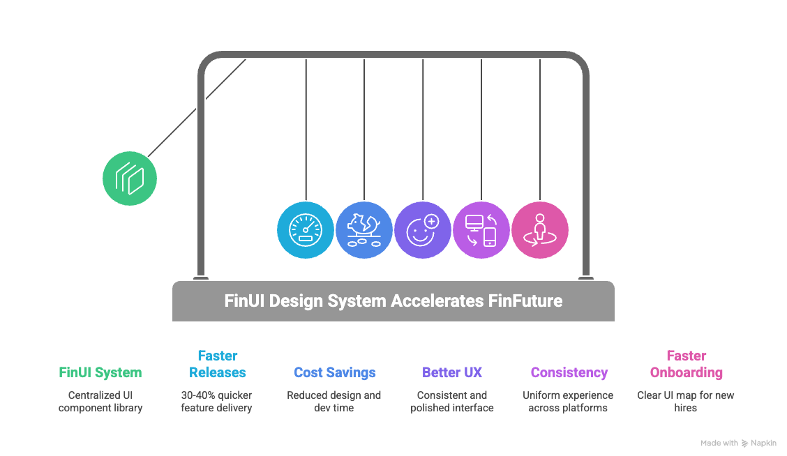
The Results: Business Impact of FinFuture’s Design System
The transformation at FinFuture after implementing their design system (FinUI) was dramatic. It affected nearly every aspect of their product development and user experience for the better. Let’s look at the before-and-after impact through key metrics and qualitative improvements:
Faster Release Cycles: Before the design system, FinFuture’s feature releases had slowed to a crawl – integrating design took a lot of extra time for each project. After FinUI was in place, the product team noticed a significant acceleration. Small features that might have taken 3 weeks to design, build, and test were now done in 2 weeks or less. In concrete terms, FinFuture saw roughly 30-40% faster development cycles for UI-heavy features. This aligns with industry findings: design systems can reduce design time by 30–50% and development time by up to 37% on average . Another real-world data point: a fintech company that built a unified design system cut prototype creation time by 50% (thanks to reusable components) and saved 6–10 days of dev time per project because there were far fewer handoff issues or redesigns needed . FinFuture experienced similar gains – their engineers no longer spent days arguing over UI details or re-coding components from scratch. It was mostly plug-and-play, which meant features moved from idea to live faster. For a startup, that speed can be the difference in capturing market opportunities.
Time and Cost Savings: Faster cycles translated into real cost savings. By eliminating duplicate work and reducing the back-and-forth between design and dev, FinFuture was effectively saving engineering hours – which is money saved or reallocated to other tasks. One large organization reported saving thousands of hours annually by using a design system across teams . FinFuture’s scale is smaller, but even if they saved a handful of developer/designer hours each week, over months that became the equivalent of having an extra full-time team member’s productivity. Also, because components were pre-tested and standardized, there were fewer QA cycles and fewer bug fixes needed related to UI. A design system “reduces the need for extensive quality assurance and revisions, as the likelihood of errors or inconsistencies decreases” . FinFuture’s QA team indeed saw a drop in visual bugs (for example, no more misaligned text or wrong colors on one page vs another). With less time fixing those issues, they could focus on more important testing, further speeding up delivery.
Improved User Experience & Trust: Perhaps the most gratifying result was the feedback from users. The product’s interface now felt consistent and polished. Users no longer encountered jarringly different designs as they navigated the app; flows were predictable and familiar. This consistency improved overall UX – users completed onboarding and key tasks (like setting up a budget or initiating a transfer) with fewer errors and less confusion. Fintech is a field where user trust is vital. After FinUI’s revamp, FinFuture’s customers reported higher satisfaction in surveys and were more likely to recommend the app. Consistency breeds trust: when users see the same UX logic across every part of the platform, it “improves user confidence, reduces drop-offs during critical actions, and increases retention” . An added bonus: FinFuture’s accessible design (color contrast fixes, proper labels, etc.) meant that visually impaired users or those on older devices could use the app more easily, widening FinFuture’s audience and demonstrating inclusivity. Overall, the brand perception shifted from “startup with great idea but rough UI” to “professional and reliable fintech app,” which is exactly what the founders wanted as they wooed bigger enterprise partners.
Cross-Platform Consistency: With FinUI applied across web and mobile, FinFuture delivered a true omni-channel experience. A user could switch from the web app to the mobile app and feel at home – the design system ensured the same icons, terminology, and interactions were present. This simplified scalability was crucial as they planned to launch an iPad app and perhaps a white-label version for a partner bank. Because they had a design system, spinning up a new platform interface was not an ordeal – they could reuse the same components and tokens, adjusting as needed. The design system essentially future-proofed them for multi-platform expansion. In fintech, where you might have customer-facing portals, admin dashboards, mobile apps, etc., having a unified design system dramatically simplifies scaling into new platforms.
Reduced Onboarding Time and Improved Collaboration: Internally, the mood and efficiency of the team improved. New designers and developers coming in were now given a clear map of the UI landscape – the FinUI documentation and component library. Instead of spending their first weeks deciphering the style of each part of the product, they could start building using established patterns. FinFuture’s HR noted that new hires became productive faster, cutting the onboarding time significantly. The existing team also found collaboration smoother. Designers no longer threw wild new ideas into each feature without considering the system; they worked within the guidelines or consciously extended them. Developers likewise were happy to have fewer “from scratch” UI tasks – they found it rewarding to focus on more complex logic rather than constantly fiddling with CSS. According to one study, a well-integrated design system leads to a more fulfilling work experience for designers and developers because they can focus on solving new problems instead of “repeatedly fixing the same issues” . At FinFuture, team members indeed expressed less frustration (remember how earlier they were frustrated solving the same UI issues? That was largely gone) and more pride in the overall product consistency.
Key Metrics Before vs After (Summary): To summarize the quantitative impact:
Release frequency: Before, major updates every 4–6 weeks; After, every 2–3 weeks (roughly 2× faster releases).
Development speed: Before, developers often spent ~30% of time on UI rework; After, that dropped to ~10% since most UI was standardized – effectively freeing 20% dev capacity.
Prototype/design speed: Before, every new feature required custom design; After, designers could assemble prototypes in half the time using the component library (up to 50% faster prototypes in some cases) .
UI bugs reported: Before, dozens of visual inconsistencies per release; After, very few (reports dropped by an estimated 70%, as many potential issues were eliminated by using proven components).
Onboarding time for new dev/designer: Before, ~1 month to be comfortable with UI code; After, perhaps 1-2 weeks with the design system guide in hand.
User engagement: While hard to attribute solely to design, FinFuture saw a small uptick in user retention and task completion rates in the app. For example, completion of the onboarding workflow improved when it was redesigned with consistent patterns, contributing to a higher activation rate of new users.
Performance and Maintainability: An often overlooked benefit FinFuture reaped was improved performance and easier maintenance. With a single set of optimized components, the app’s front-end was leaner – no redundant libraries or excess styles. As mentioned earlier, reducing 299 unnecessary style variants to a unified set made the web app load faster and run with fewer hiccups (one case saw checkout speeds improve after consolidating styles ). FinFuture’s developers also found the codebase easier to maintain: instead of five different implementations of a dropdown to update, there was one. Fixes or improvements could be made in one place and reflected everywhere. This maintainability is like paying off a huge portion of technical debt; it means the team can be more agile going forward rather than bogged down by past inconsistencies.
In summary, FinFuture’s investment in a design system paid off enormously. They transformed a snarled, inconsistent product into a streamlined, professional one. The business impact was clear in time saved, faster releases, and a better user experience that drives trust – a critical currency in fintech. As one of the founders put it, “It’s like we cleaned up a messy workshop – now everything has its place and purpose, and we can build new things so much faster.”
Choosing a Design System Framework: Ant Design, Material-UI, or Shadcn?
When building a design system, one important consideration is whether to use an existing UI framework or library as a foundation. Many startups debate whether to go with something like Ant Design, Material-UI (MUI), Shadcn/UI, or other design system frameworks, versus creating everything custom. FinFuture also faced this decision early on. They evaluated a few popular options to see how they might fit a fintech context:
Ant Design (AntD)
Ant Design is an open-source design system and React UI library originally developed by Alibaba’s Ant Financial. It’s often touted as a design system for enterprise applications, and it comes with a comprehensive set of components out-of-the-box . Many fintech and business applications favor AntD because it excels at data-dense components (tables, forms, charts integrations) and has a clean, professional aesthetic by default.

Pros (Fintech context): AntD provides a huge suite of pre-built components and a well-thought-out design language. This means a startup can get productive very quickly by leveraging AntD’s library for common needs like form layouts, navigation menus, modals, and more. It also has built-in localization and accessibility for its components, which is useful for global fintech products. The consistency AntD brings can solve the exact problems FinFuture had – instead of each developer rolling their own UI, they follow AntD’s guidelines. In fact, some fintech products choose AntD as a starting design system, then customize it to their brand. Since Ant Design was created by a financial giant, it’s well-suited to financial dashboards and back-office tools, which often align with the enterprise UI patterns AntD supports. AntD’s documentation and ecosystem (including Figma kits and community plugins) are robust, so designers and developers can be “on the same page” easily. Another plus: AntD supports theming – you can inject your brand colors and typography relatively easily to get a custom look while keeping the underlying structure.
Cons: The very completeness of AntD can be a double-edged sword. It’s a large library, which might add weight to your app if you’re only using a fraction of the components. Also, because it has a distinct visual style (influenced by Chinese design aesthetics and enterprise look), some fintech startups find they need to heavily customize it to avoid looking too generic or “like Ant Design.” Deep customization, however, can be challenging; you might end up fighting against some default styles. There’s also the risk of relying on a framework that might not exactly match your product’s needs – for example, AntD might have its own approach to certain interactions that you’ll have to either accept or put effort into changing. If a startup’s goal is a highly unique, brand-differentiating UI, starting from AntD might be limiting unless you have resources to overhaul its theme. Finally, consider long-term control: using any external framework means you adopt their updates (or choose to freeze a version). If AntD changes something or deprecates a component, you’ll need to adapt. Fintech startups in regulated environments might be slower to upgrade due to compliance/testing needs, so being tied to an external release cycle could be a minor drawback.
Use case verdict: Ant Design is great if you want a solid, time-tested design foundation for an app that has a lot of standard enterprise UI elements (forms, tables, steps) – common in fintech admin or analytics modules. It can jump-start your design system and you can gradually infuse more custom branding. FinFuture considered AntD and liked its comprehensiveness, but they worried it might impose too much of a “cookie-cutter” feel on their unique consumer-facing app. In more B2B fintech or internal tool scenarios, AntD could be a strong starting point, delivering consistency and saving design effort upfront.
Material-UI (MUI)
Material-UI (MUI) is a popular React implementation of Google’s Material Design system. Material Design is ubiquitous – it’s the design language behind Android and many Google products, known for its clean, card-based layouts, bold colors, and mobile-friendly components. MUI provides a large set of ready-made components that follow Material guidelines, and it’s widely used across industries.
Pros: MUI’s biggest strength is that it’s familiar and proven. Users have seen Material Design in countless apps, so using MUI can make your app feel instantly intuitive to many. It’s great for rapid prototyping – you can whip up a decent-looking interface quickly, which is useful for MVPs or early testing. For a startup under time pressure, MUI can save tons of design and front-end time by offering pre-styled components that are pretty much ready to go . The community and support around MUI are huge – lots of documentation, third-party extensions, and developers who know it. It also has a theming system where you can set your primary and secondary colors, etc., to apply a basic brand skin. Many fintech startups initially use MUI for these reasons: easy talent availability (almost any front-end dev has touched MUI or Material at some point), speed of development, and a baseline of good UX practices (material components are generally accessible and well-structured). If FinFuture were purely focused on quick time-to-market, using MUI components could have been a viable short-term strategy, giving them consistency from day one (via Google’s design rules) and letting them focus on functionality. It’s telling that experts acknowledge Material Design “makes sense from a business perspective – finding designers and developers familiar with Material is easy” and it provides an excellent framework to launch apps fast .
Cons: The flip side is that Material Design is very opinionated. It has a specific look and feel that might not align with the distinct brand identity a fintech wants. In fact, some product teams find Material Design too constraining or generic for long-term use. As one CTO described, Material UI is great for getting started, but “over the long run, it becomes limiting… the framework itself restricts innovation” . This is particularly relevant in fintech where you might want custom visualizations or interactions that Material doesn’t easily support. If FinFuture wanted to create, say, a very custom drag-and-drop financial planning interface or a novel data viz, they might find MUI’s components don’t cover it, and they’d have to build custom anyway. Moreover, customizing MUI deeply (beyond color/theme tweaks) can be complex. For example, overriding Material’s styles to create new component variants or significantly alter component structure might lead to a lot of work and brittle code. Another consideration: because MUI is so common, an app built with it can risk looking “yet another Material app” – not ideal if you want to stand out. And as your app grows, you might find yourself needing to diverge from Material guidelines; at that point, continuing to use MUI might feel like forcing a square peg into a round hole. In practice, teams that start with MUI often end up incrementally replacing parts of it with custom components as their design system matures – which is doable, but requires effort. Also, keep performance in mind: MUI is fairly optimized, but including the whole library when you use only some parts can increase bundle size (tree-shaking can mitigate this to an extent).
Use case verdict: MUI is an excellent choice for early-stage products or tools where the priority is speed and standard best practices. It covers the basics of design consistency and is very developer-friendly. But for a fintech platform aiming for a very tailored UX or planning to evolve over many years, relying solely on MUI could eventually feel like a box around your design. As one article suggested, if your planning horizon is short (get something out in 6 months), MUI is perfect, but if you know you’ll be building and evolving the product for 5+ years, you might invest in a more custom system to avoid hitting a wall later . FinFuture used some Material UI components early on, but they discovered its limits when they tried to implement unique features, which partly spurred them to build FinUI. In combination approaches, some startups use MUI as a foundation and then gradually morph it into a custom design system by overriding styles and adding custom components – this can work if done carefully.
Shadcn/UI
Shadcn/UI (often just called “shadcn”) is a newer entrant that gained popularity in 2023. Unlike AntD or MUI, shadcn isn’t exactly a traditional component library; it’s a collection of accessible, unstyled (or minimally styled) React components that you copy into your project and then customize to your needs . It’s built on top of Radix (a library of low-level accessible primitives) and often used with Tailwind CSS for styling.
Pros: The philosophy of shadcn/UI is ultimate customization and ownership. Because you literally take the source code of the components into your codebase, you have full control to modify and style them as you wish, without being constrained by an external library’s theming limitations. For a fintech startup that wants a completely unique look but doesn’t want to build every component from scratch, this is a compelling model. Shadcn gives you the building blocks (buttons, dropdowns, tables, etc.) that are already functional and accessible, but it doesn’t impose a design on them – you add your own theme classes (often via Tailwind). In terms of performance, this approach can be very efficient: you only bring in the components you need, so there’s no bloat from unused components, and since you style them with utility classes, the final CSS can be very minimal (Tailwind will purge unused styles, etc.) . This addresses the bundle size concerns of big frameworks. Teams have highlighted shadcn’s ease of use and scalability when you have the skill to craft your own theme; it’s basically a shortcut to a custom design system, saving you from writing all the ARIA roles and JavaScript for component behavior, but letting you design the aesthetics freely . Another pro is longevity: by owning the code, you’re not subject to external breaking changes – you evolve the components as you need. For a startup with experienced developers who are comfortable with React, Tailwind, etc., shadcn/UI can provide a flexible foundation that grows with your product.
Cons: The flexibility of shadcn comes at the cost of initial effort. Unlike MUI where you can drop in components ready-made, with shadcn you have to manually copy and integrate each component you want to use . This can be tedious if you need many components quickly. It’s essentially like maintaining your own internal library (which is the point, but that’s more responsibility). If FinFuture had chosen shadcn at the very start, their developers would need to have a good handle on Tailwind CSS and be willing to own a lot of UI code. For a very small or less-experienced team, this might be challenging under tight deadlines – it’s easier to plug in a fully pre-built library. Additionally, not everyone likes the Tailwind CSS approach (utility-first classes in JSX). Some find it great, others find it cluttered in the markup. Maintaining lots of custom components also means you need to set up good practices (documentation, consistent coding style) internally – essentially, you are creating a design system (which was the goal anyway). There’s also the factor that shadcn/UI is quite new. While it’s trending, it doesn’t have the decades of community that Material or Ant have. That might mean fewer tutorials or unknown edge cases. However, since it’s largely based on Radix for logic (which is solid) and Tailwind for styling, the risk is mitigated. Another shortcoming: if you suddenly need a complex component that shadcn doesn’t have yet, you might have to implement it yourself or find another source, whereas big frameworks often have almost everything. In short, shadcn is more DIY-friendly but demands a certain level of expertise and willingness to be hands-on.
Use case verdict: Shadcn/UI is ideal for teams that prioritize custom design and performance and have the front-end expertise to manage it. It’s like getting the best of both worlds between building your design system entirely from scratch and using a library – you get scaffolding but retain freedom. For a fintech that wants to differentiate on UX or has specific UI needs (like complex interactive charts, custom workflows), shadcn gives the flexibility to do that without starting from zero on component logic. FinFuture, if starting over, might use a hybrid approach: utilize shadcn for core components so they can fully brand them, while maybe borrowing some patterns from Material or Ant for guidance. It’s worth noting a take by one review: for products without plans of drastic transformation and that need to move fast, using shadcn for only what you need can be more efficient than adopting a huge UI kit like MUI and then ignoring half of it . That resonates for startups – why carry the weight of a thousand components if your app initially needs fifty? You can start lean with shadcn and add as you grow.
In summary on frameworks: FinFuture’s journey led them to craft a custom design system (FinUI) without strictly adopting any single external framework wholesale. They did, however, draw inspiration and even code from some of these sources:
They used Radix (like shadcn does) for accessible primitives (e.g., the accessibility logic for modals, dropdowns) to avoid reinventing the wheel.
They referenced Material Design guidelines for general best practices on spacing and responsive layout, even if they didn’t use MUI directly. Material’s influence is industry-wide, and FinFuture wasn’t shy to leverage good ideas (like consistent elevation levels for shadows, standardized breakpoints, etc.).
They looked at Ant Design for ideas on how to structure complex components (like tables and filters) and even used an Ant Design component library for Figma as a temporary measure until their own was ready – speeding up design work by not starting from zero.
Each framework has its pros and cons in fintech: AntD is enterprise-robust, MUI is familiar and fast, Shadcn is customizable and lean. The choice often depends on a startup’s immediate needs versus long-term vision. A pragmatic approach can be: use one to get started (for speed), plan to evolve to something more custom as you scale (for flexibility). The key is to maintain consistency – even if you switch or mix frameworks, establish a unified style guide so the end product stays cohesive.
How External Partners (like INSART) Help with Design Systems
FinFuture was fortunate to realize the need for a design system and execute it relatively early. But many startups only confront these issues when they become painful, and by then the product might be quite large. This is where external experts can provide a big boost. INSART (to use the example mentioned) is a fintech engineering firm that, among other things, helps companies improve their product design and front-end architecture. How might a company like INSART approach building or adapting a design system for a client?
Typically, an external partner would start by assessing the client’s current UI state – much like FinFuture’s audit, but faster since they have a playbook. They’d identify inconsistencies, redundant components, and gather requirements about the brand and domain (e.g., a wealth management app will have different design needs than a payments app).
An agency with fintech focus knows the common patterns needed: KYC workflows, trading dashboards, account overview components, compliance disclosures, charts, etc. They might bring pre-existing templates or design frameworks tailored for fintech. For example, they know that a stock trading interface needs real-time updating components and they might have a baseline design system that includes those patterns. INSART or similar companies would then work with the client’s team to refine these into a bespoke design system that fits the client’s brand.
Importantly, firms like these treat the design system as part of the overall product strategy. They ensure that it aligns with the technical stack (e.g., if the client uses Angular, they’d implement the design system in Angular components; if React, perhaps Storybook and so on). They often also help build internal consensus – one challenge of introducing a design system is getting everyone to actually use it. A third party can act as a moderator, creating guidelines and governance, and convincing stakeholders of the long-term value.
In one case study snippet, INSART transformed a fintech product and explicitly noted building a “design system for consistency” as a key step in the process . They recognize that consistency is crucial in fintech apps where users deal with sensitive info and need a reliable UI. An external team can also do the heavy lifting of documentation and training: they might create the style guide site and run workshops with the client’s designers and developers to get them onboard with the new system.
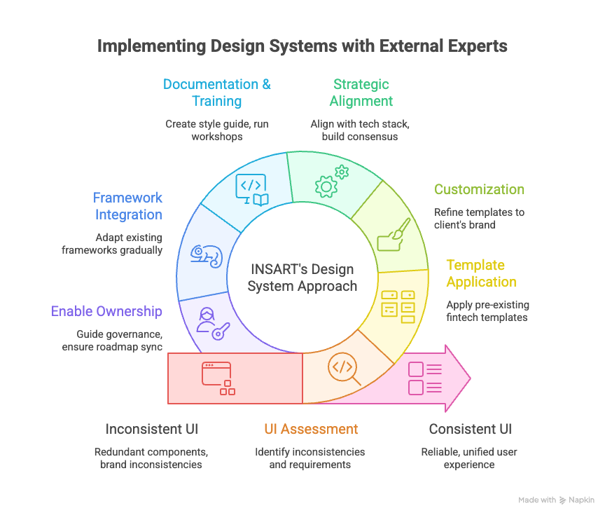
Another thing companies like INSART might do is help integrate existing frameworks. If a client already started with Material or Ant but is hitting limits, an expert partner can help gradually reshape that into a more custom system – essentially adapting a framework to the client’s context. For example, they might prune unused AntD components, customize themes, or write new components to fill gaps, so that the end result is a quasi-custom design system without starting from scratch.
For FinFuture, engaging a fintech-savvy design partner meant they accelerated through the painful parts of system building (like the initial audit and component setup) and avoided pitfalls. They got advice on things like how to structure their tokens, how to document effectively, and even on maintaining the system over time. INSART’s general approach – like many agencies – is to not just build the system and leave, but to enable the client’s team to own and grow it. They likely provided guidance on governance (who should be responsible, how to handle requests for new components, etc.) and on making sure the design system stays in sync with the product roadmap (e.g., if a new feature is coming, plan the needed extensions to the design system proactively).
In short, partners like INSART bring experience and frameworks to jump-start a design system, plus a neutral perspective to unify a product’s UX. They ensure that the design system is not an afterthought but a core part of the development process, which ultimately leads to time-efficiency and better product quality in fintech projects . For startups that don’t have in-house expertise, this can dramatically reduce the time it takes to implement a design system and help avoid costly mistakes (like over-engineering it, or making it too rigid or too loose).
Lessons Learned and Best Practices for Startups
FinFuture’s journey offers a number of lessons and best practices for other founders and product leaders embarking on their first platform – especially in fintech, but these insights apply broadly as well:
Don’t Wait Too Long to Start a Design System: One takeaway is that FinFuture could have benefited from implementing a design system even earlier. Hindsight is 20/20, but knowing what they know now, the team realized that some initial chaos could have been avoided by introducing basic design guidelines from the start. For other startups, consider establishing a simple design system as soon as your product begins to grow beyond a few screens. This doesn’t mean spending months upfront, but even a lightweight style guide and a shared component repo early on can save a lot of redesign later. In fintech especially, a design system should “absolutely be one of the first things” put in place as you build a product, because it sets the stage for scalable growth . It’s harder to retrofit consistency after hundreds of disparate screens have been built; easier to lay the foundation when your product is still small.
Iterate and Evolve the System – Treat It as a Product: A design system is not a one-off project to “set and forget.” FinFuture learned that it requires ongoing care. They set up a process to continuously improve FinUI, taking feedback from users and team members to update components or guidelines. Other startups should similarly view their design system as a living product within the product. Assign it owners, as FinFuture did, and keep a backlog for it. As your app introduces new features or new tech (say you add a wearable device interface, or new accessibility needs), fold those into the design system. Regularly review if the system is meeting the team’s needs. If something is not working (maybe a certain component is too inflexible), refine it. This proactive maintenance ensures the design system stays relevant and useful. Also, update documentation iteratively – don’t wait for it to become outdated; integrate it into your development workflow to update the style guide whenever a change is made .
Cross-functional Collaboration is Key: One of the strongest themes in FinFuture’s success was the tight collaboration between designers, developers, and product managers. The design system effort wasn’t dumped on one person; it was a team goal. Designers took input from developers (to ensure components were feasible and efficient to code), and developers respected the design details (helping to recreate them faithfully in code). This aligns with what other teams have noted: Collaboration is crucial. For example, KredX’s design manager emphasized that they couldn’t have built their system in a silo – everyone needed to align and communicate openly . So, involve all stakeholders in your design system initiative. Host joint workshops, get input from customer support (they know what UI confuses users), include QA (they’ll point out inconsistent behaviors), and of course management (to sponsor the effort). When everyone is part of building the system, they are also more likely to embrace and follow it.
Keep the User at the Center (Even in a Design System): It’s easy to get lost in the internal benefits of a design system (consistency, speed, etc.), but the ultimate judge is the user experience. FinFuture’s team constantly referred back to user needs while standardizing their UI. For instance, they realized that some advanced features should mimic tools their users were already comfortable with (like designing complex tables akin to Excel for finance teams) . They tailored parts of the design system to user behavior – one size does not fit all, and a good design system can allow different UX for different user segments under one unified style. The lesson is to ground your design decisions in user research. If your fintech’s users value a “human” touch, maybe your design system includes guidelines for friendly language and approachable visuals, not just strict grids and charts. FinFuture’s system included slightly rounded corners and a less formal vibe to “humanize fintech” for their customers . That kind of detail comes from knowing your audience. In short, design systems should serve and enhance the UX, not become an abstract exercise. Use user-centric design principles – test components with real users if possible (e.g., is the new unified form actually easier to use?), and gather feedback.
Enforce Consistency but Allow Flexibility: There’s a balance to strike between rigidity and flexibility in a design system. FinFuture’s early chaos taught them the cost of too much flexibility (everyone doing their own thing). But they also knew if the design system was too rigid, it could stifle creativity or not account for edge cases. Best practice here is to define the core 80% very strictly – the primary colors, the main typography, the standard components for common functions – and allow some modularity or extension for the other 20%. FinFuture did this by allowing some customizations per context (e.g., their complex tables for certain power-user screens were a special case styled slightly differently, but still under the design system umbrella) . Your design system should have mechanisms for exceptions – perhaps a section in documentation on “custom components” or a process to introduce a new pattern when needed. It’s like a constitution with an amendment process. This way teams don’t feel completely handcuffed, yet the overall product stays coherent. Also, regularly evaluate if any “one-off” solution is becoming common – if yes, fold it back into the system to maintain unity.
Accessibility and Compliance from Day One: FinFuture’s lesson (and a critical one for fintech) is to integrate accessibility and regulatory compliance into your design system from the start. It’s much easier to build components that are accessible than to fix them later across an app. FinFuture saved itself future headaches by making color contrast a requirement and including states and roles for assistive tech in every component. The best practice is to use standards (e.g., follow WCAG guidelines, use semantic HTML in your component code) and maybe even include accessibility checks in your design reviews. Similarly for fintech, consider compliance-related UI early: if your app needs to show certain disclosures, or collect specific info for KYC, standardize those patterns. FinFuture’s design system included components for KYC steps and error messages, ensuring consistent compliance UX . This approach can speed up approvals and reduce legal risk because you know every feature is using approved flows . It’s easier to convince an auditor or bank partner of your reliability when you can demonstrate a systematic approach to these elements.
Leverage Frameworks but Make Them Your Own: We discussed Ant, MUI, Shadcn – the takeaway for FinFuture was that no off-the-shelf system fits perfectly, but they all have something to offer. For other startups, the lesson is not to reinvent the wheel unnecessarily. If Material’s button is perfectly fine, use it – but maybe skinned to your theme. If Ant Design offers a great starting point for an internationalization or date-picker component, leverage it. Just ensure you unify the style. The worst outcome is mixing frameworks without coherence (e.g., half your app looks Material, the other half Ant Design – avoid that). Instead, if you mix, do it under a unified theming. And as you grow, contribute back or open-source some of your own components if they’re generic – it’s a good way to engage with the community (some of FinFuture’s custom work might eventually be useful to others, who knows). Essentially, be pragmatic: use what helps you move fast, but always align it to your overarching design system rules.
Measure the Impact: To justify the effort and keep improving, measure the effect of your design system. FinFuture did this informally at first (noting faster sprints, less rework), but they eventually set some KPIs like “time saved per release” and “number of support tickets related to UI issues.” They could concretely see improvement, which helped reinforce the team’s commitment to the system. The best practice is to define success metrics for your design system as recommended by experts . These might include:
Time to design and develop a feature (see if it decreases).
Number of different design variants of a given component in use (should go down to one!).
Developer and designer satisfaction (survey the team – do they find the system helpful? Often, morale goes up when repetitive work goes down).
User metrics like conversion or task success rate before vs. after a redesign under the new system (FinFuture saw drop-offs reduce in key flows when consistency improved).
Even hard ROI in terms of cost saved (some companies calculate hours saved * average hourly cost to show leadership the value in dollars).
Enjoy the Process and Celebrate Victories: Building a design system can be challenging, but FinFuture’s team actually found it rewarding. As the KredX case study author said, it was one of the most rewarding projects tackled, creating a shared language that made everyone’s job easier . It truly is like cleaning a messy room or refactoring spaghetti code – it may be tough work, but the outcome feels great. So, celebrate the small wins: when you unify the color palette, when the first feature is built entirely with the new system in half the time, when a new hire says “wow, this guide is super helpful.” These morale boosts will keep the momentum. Also, once the design system is in place, the team can have more fun with innovation because the basics are handled. FinFuture’s designers, for instance, could start exploring more imaginative improvements (like new data visualizations) now that they weren’t bogged down designing basic forms for the tenth time.
Conclusion
For fintech SaaS startups, a design system is more than a toolkit – it’s a strategic investment in your product’s scalability, consistency, and quality. FinFuture’s case showed how messy things can get without one, and how much brighter the picture is after. By crafting a narrative of chaos to clarity, we see that design systems save time, reduce costs, and lead to better products and happier teams. The business impact is tangible: faster release cycles, a stronger brand presence, and a user experience that builds trust (crucial when dealing with people’s money).
Founders and product leaders should take to heart that while it does require upfront effort, a good design system pays for itself – often many times over. It’s like building a solid foundation for a house; everything constructed on top of it will be more stable and easier to modify. In the fast-moving fintech world, where you might need to quickly adapt to new regulations or customer expectations, having that solid design foundation means you can adapt with confidence and speed.
In the end, FinFuture’s journey turned a cautionary tale into an inspiring one. With their FinUI design system, they went from scrambling through UI chaos to confidently delivering a cohesive product that users loved. And perhaps the most telling sign of success: the team could innovate faster and focus on what truly matters – solving users’ financial problems – instead of wrestling with their UI. That’s the real power of a design system: it frees you to focus on building the future of your fintech product, not fixing the past.


")


